Sanza Mpofu

Hello there! I'm Sanza, a Senior Product Designer currently at CANAL+ Group, living in Johannesburg. I've spent the last 10 years designing digital products across fintech, banking, and media for the South African market.

I believe that great UX is to make users feel in control.

Sanza Mpofu
Experience & Work
CANAL+ Group
Oct 2025 — Current
Senior Product Designer

Tasked with improving functionality across CANAL+'s leanback TV experience. Ran a heuristic evaluation and trends research, then designed two concepts: Mobile Companion and Hand Gestures, that improved usability and accessibility together.

Media & TV Accessibility
Standard Bank
Sept 2024 — Sept 2025
Senior Product Designer

Supported the migration of business customers from the legacy OBB platform to OB4B. Designed a coachmark system that helped customers discover and adopt new features without relying on support calls.

Fintech Onboarding
FNB
Dec 2021 - Aug 2024
UI/UX Specialist

Designed core banking flows over three years, including a self-serve account and service switching feature that gave customers control over moving between banks without relying on call centre staff.

Banking Self-Service
Experience
PwC
UX Specialist
Nov 2019 — Nov 2021
Afrocentric Group
Specialist: Web Services & Graphic Designer
Oct 2016 — Oct 2019
Trudon
Graphic Designer
Nov 2012 — Sep 2016
How I think about design

Constraints aren't the enemy of good design — they're the brief.

Coachmarks, the FNB switching flow, and the CANAL+ Group concepts look like different problems on the surface — a broken redesign, a call-dependent process, a remote-first interface. But each one came with a real-world constraint that ruled out the "ideal" answer: a redesign that couldn't be reverted, a process that couldn't wait on staff availability, a habit that couldn't be unlearned overnight.

My approach in all three was the same — understand exactly what's actually fixed and what's actually flexible, then design the best possible experience inside that real boundary, instead of designing for a version of the problem that doesn't exist. That's usually where the most honest, shippable design work lives.

Capabilities
Design
UX / UI Design
Design Systems
Prototyping
Accessibility (WCAG)
Research
User Research
Usability Testing
Journey Mapping
Competitor Analysis
Strategy
Product Thinking
Design Leadership
Stakeholder Mgmt
Design Ops
Tools
Figma
FigJam
HTML / CSS

Let's talk.

Open to product strategy and design leadership conversations or just a good UX debate.

Media & TV Accessibility CANAL+ Group

Mobile Companion & Hand Gestures: making the leanback experience easier for everyone

Role
Senior Product Designer
Company
CANAL+ Group
Brief
Improve functionality for all users
Focus
Search · Control · Accessibility

Two everyday frustrations, one underlying brief.

The team was tasked with looking into how to improve functionality for all users across CANAL+'s leanback TV experience. Out of that broader brief, I was assigned two specific concepts: Mobile Companion and Hand Gestures.

Both concepts trace back to the same root problem: the remote control and on-screen keyboard are the two most friction-heavy parts of watching TV. And both solutions ended up doing double duty: improving the experience for everyone, while also meaningfully improving accessibility for users who struggle with fine motor control or on-screen typing.

The remote and the keyboard were both working against people.

⌨️
Typing on a TV is painfully slow
Entering a search query with a directional remote and an on-screen keyboard takes far longer than typing or speaking on a phone people already carry.
🎮
The remote is a barrier, not just an inconvenience
For users with limited dexterity, holding and operating a small multi-button remote is a genuine access barrier, not simply a mild annoyance.
Accessibility wasn't being designed for directly
Existing improvements to the interface focused on convenience for the average user, without deliberately addressing fine motor or dexterity constraints.

Grounded in evaluation, not assumption.

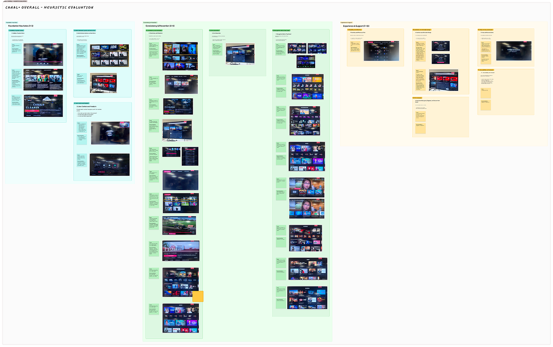
Before proposing solutions, I conducted a heuristic evaluation of the CANAL+ leanback experience, reviewing the existing interface against established usability principles. The evaluation surfaced issues across six areas:

🗣️
Language & terminology inconsistency
Mixed French and English across the interface, inconsistent terms between platforms (e.g. "Programme TV" on leanback vs "TV Guide" on web), and unclear labels like "Rewatch." This directly informed the need for consistent, predictable labelling in both concepts.
🧩
UI consistency issues
Inconsistent button labels ("Play" vs "Watch"), duplicate content cards, and a mic icon that appears outside the search bar in some views, a direct precursor to the Mobile Companion search concept.
🧭
Navigation & discoverability
No sports subcategory filters, poor visual hierarchy in menus, and a keyboard focus trap on search that makes it hard for users to exit, a clear, specific motivation for moving search input off the remote entirely.
📡
Feedback & system status visibility
No clear watched/unwatched indicators, unclear progress bars, no visual pause indicator, and occasional unexplained blank screens during playback.
🚧
Error handling & recovery
Repetitive generic error messages ("An error has occurred") with no guidance on recovery, and blank screens appearing without any error messaging at all.
🎙️
Interaction & control limitations
Users can't deselect a rating, only change it, and voice search availability is inconsistent across devices, with the mic icon sometimes appearing active even when voice search isn't supported, directly shaping how Mobile Companion needed to communicate availability clearly.
UX research and app store review summary

Looking at how others were solving the same problem.

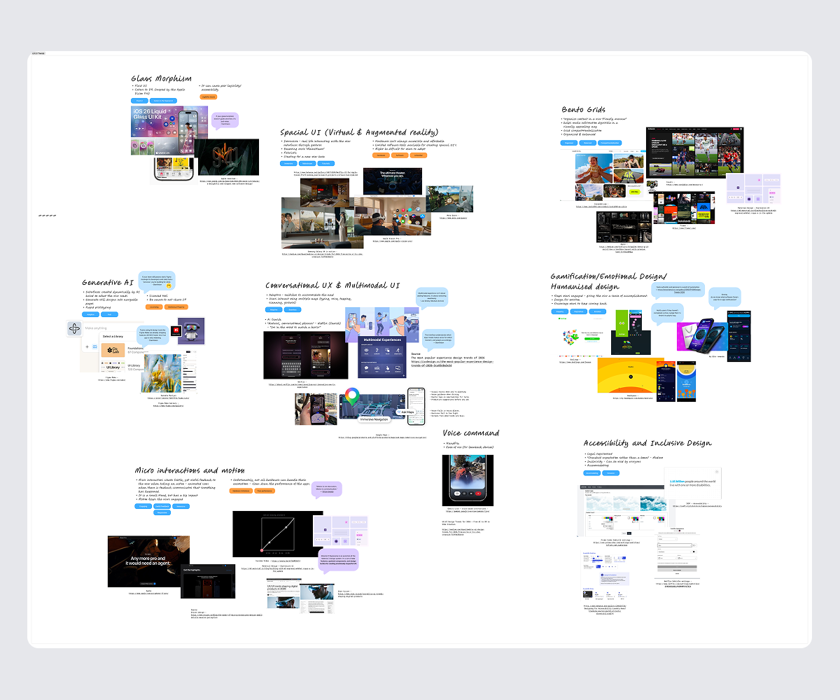
Alongside the heuristic evaluation, I researched current UX and UI trends relevant to leanback and connected-device experiences:

UX trends: AI-powered personalisation, proactive/anticipatory UX, no-UI or invisible interfaces, multimodal interaction spanning voice, gesture, and touch, accessibility-first UX, and emotionally intelligent UX. The multimodal and accessibility-first principles map directly onto Mobile Companion and Hand Gestures as concepts.

UI trends: micro-interactions and motion, gamification and emotional design (the kind that keeps people coming back, as seen in products like Duolingo), spatial UI for virtual and augmented reality, voice command, and accessibility and inclusive design.

UX research and app store review summary

What users told us directly, and what they told the world.

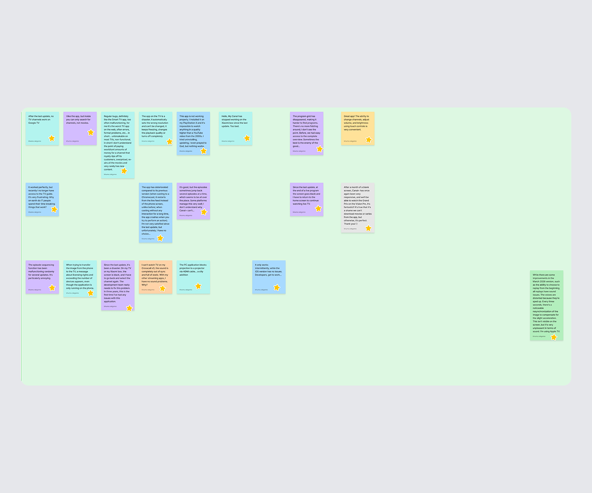
A discovery study and a review of public app store feedback gave two complementary views of the same underlying experience, one from guided conversations, one from unprompted public complaints.

UX research: The discovery research found that TV is mainly a social, cozy activity often shared with family or roommates, and that users frequently multitask, treating TV as background and focusing only on key or emotional moments. CANAL+ was appreciated for its intuitive, consistent cross-device experience and its nostalgic, familiar content. Pain points included limited original-audio or English subtitle availability, occasional buffering, and abrupt disconnections from account sharing, with one user explicitly wanting smarter, more personalised recommendations. The desired experience centred on hands-free, immersive viewing, a unified experience across devices with easy language and subtitle controls, and reliable casting and device handoff.

App store reviews: These reviews echoed and sharpened the same themes at scale: widespread technical failures including multiple error codes blocking live TV access, frequent crashes requiring cache clears or reinstalls, and video quality complaints capped as low as 240p with constant buffering. Users reported broken search functionality and missing content discovery features, playback that failed to resume or remember progress, and authentication issues including accounts locked without explanation. The search and discovery complaints in particular reinforced the case for Mobile Companion as a faster, more reliable way to find content than the existing on-screen search.
UX research and app store review summary

Two concepts, evaluated against the same criteria.

With the research pointing at two distinct friction points, search input and remote control, the process branched into two parallel concepts rather than forcing a single solution to cover both. Each concept was evaluated against the same two questions: does this meaningfully reduce friction for everyone, and does it specifically help people excluded by the current remote-first design?

From research findings to early structure.

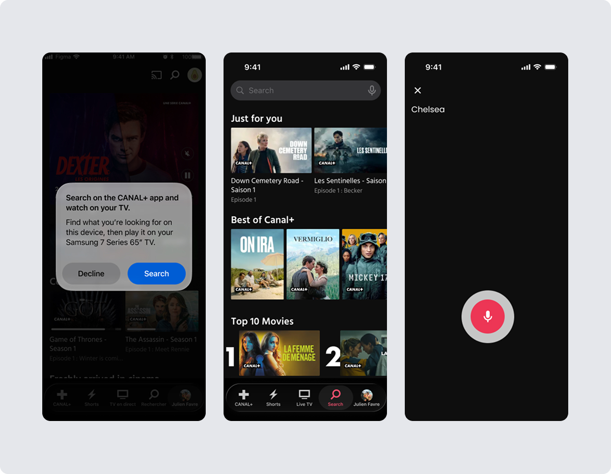
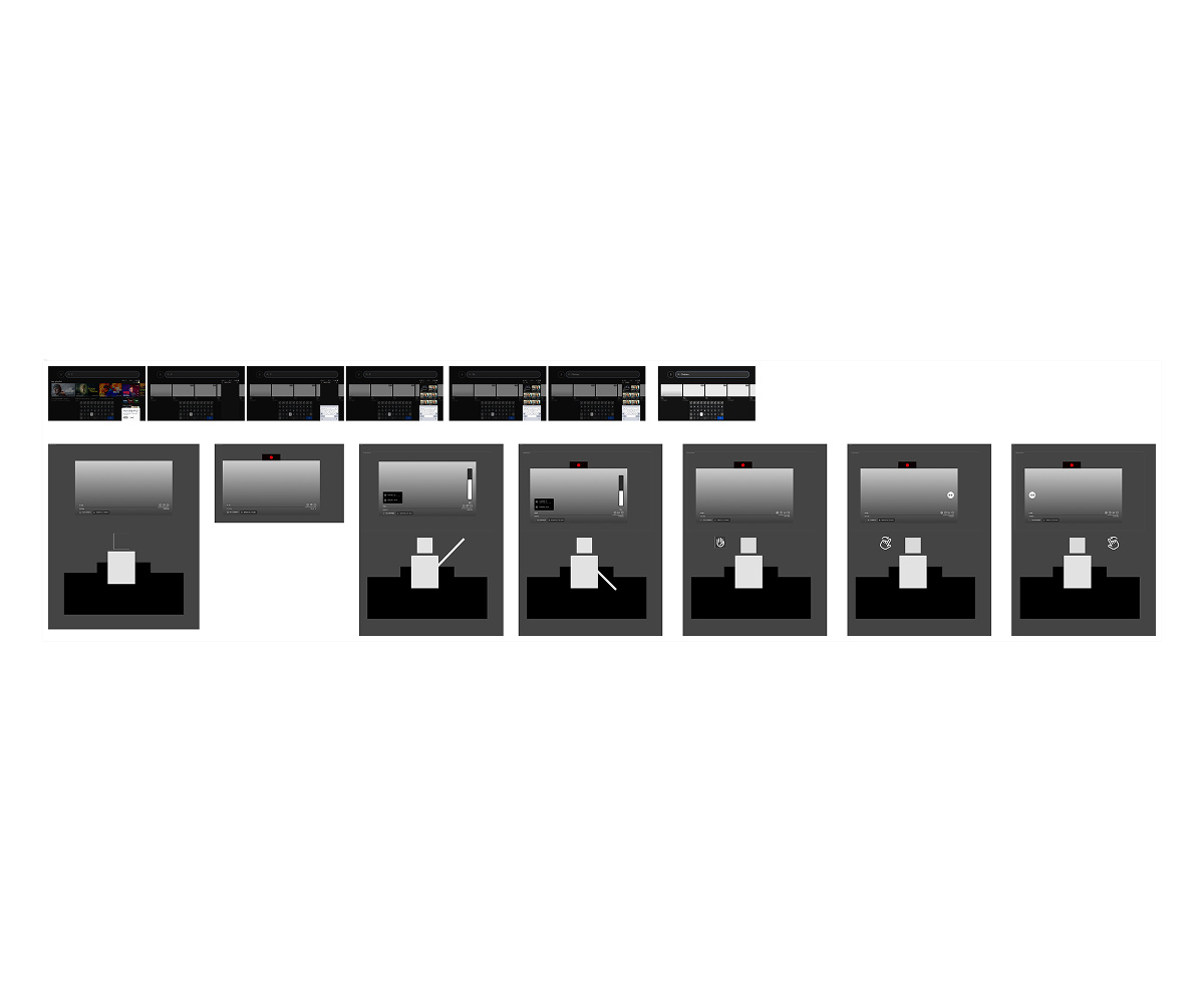
With the friction points and direction confirmed, wireframes for both Mobile Companion and Hand Gestures mapped out the core flows at a low level of fidelity, the notification handoff, the search input screen, and the gesture recognition states, before any visual design work began.

UX research and app store review summary

Nobody wants to type a show title with a remote.

Typing long search queries using a directional remote and an on-screen keyboard is slow and frustrating, every letter is a deliberate, multi-click action. Mobile Companion solves this by moving the typing (or speaking) off the TV entirely.

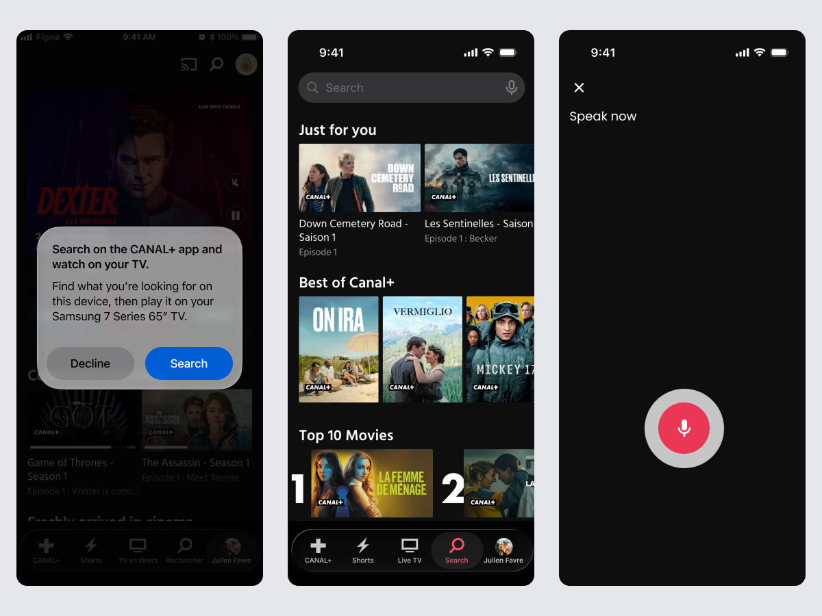
When a user selects the search bar on the TV, their phone receives a notification letting them know they can now search from their phone instead, using either text or voice input. The TV remains the display surface, but the phone becomes the input surface, replacing slow remote-and-keyboard typing with the kind of fast, familiar typing or speech people already use every day.

Notification triggered on selection
Tapping the TV search bar sends an instant phone notification, so the handoff to mobile input feels like a natural next step, not a separate setup process.
Text or voice, user's choice
Once on the phone, users can type using a full keyboard or speak their search, both far faster than remote-based input.
An accessibility win, not just a convenience one
For users with limited dexterity or difficulty with small on-screen keyboards, moving input to a familiar phone keyboard or voice removes a major barrier to finding content.
FNB switching status tracker screen

Some actions don't need a remote at all.

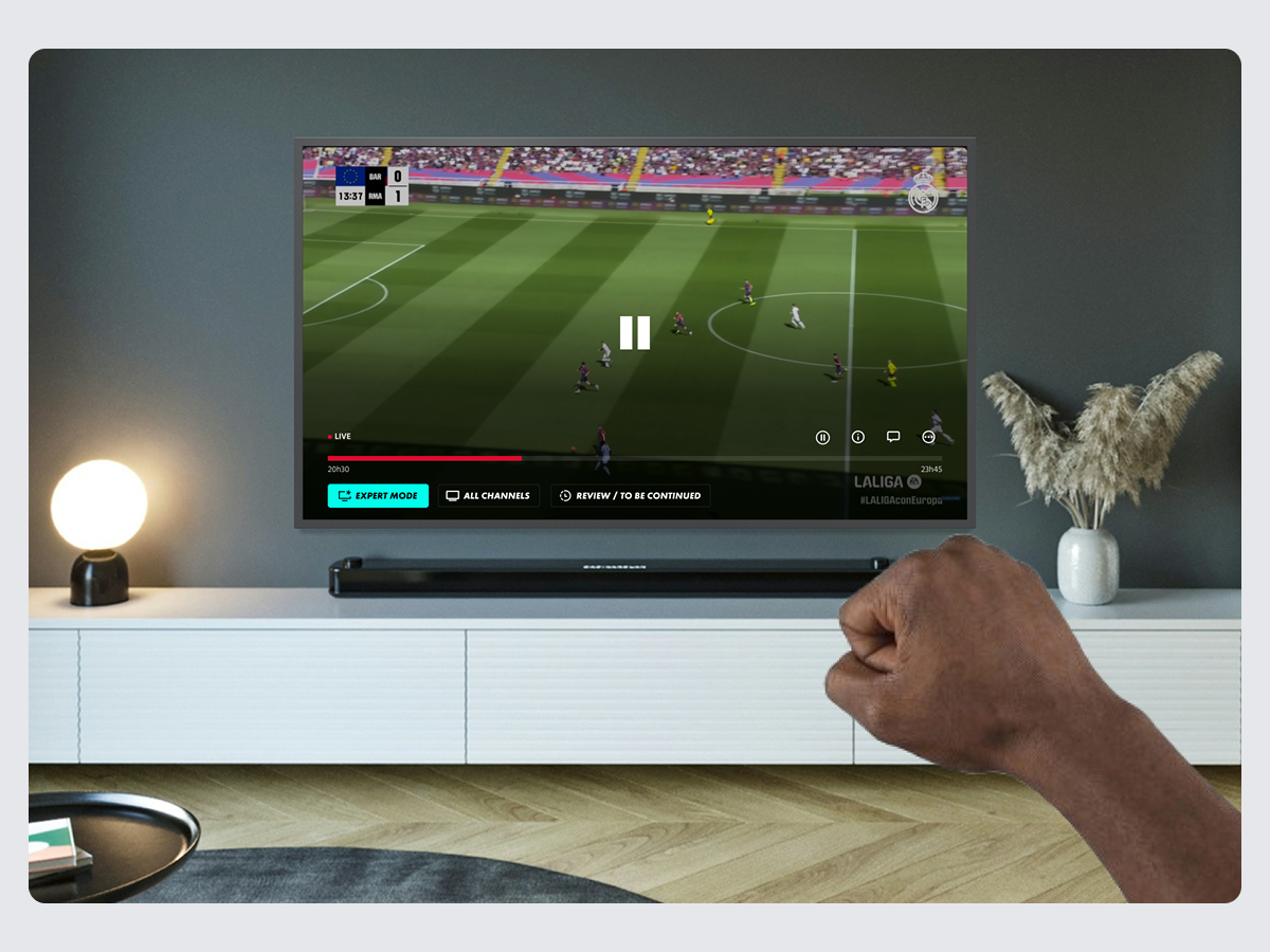
Hand Gestures lets users perform the most common remote actions using hand movements alone, no device in hand required. The gesture set was kept deliberately small, covering only the actions people reach for most during everyday viewing:

Volume: increase & decrease
A directional gesture adjusts volume up or down without touching a remote.
Playback: pause & play
A single clear gesture toggles playback, covering the most frequent in-session action.
Navigation: rewind & fast-forward
Directional gestures let users skip back or ahead, mirroring the most-used remote buttons.
FNB switching status tracker screen

Keeping the gesture vocabulary limited to these six actions meant the system stayed easy to learn and remember and like Mobile Companion, it doubles as an accessibility feature, giving users who struggle to hold or operate a small remote a viable alternative way to control their viewing.

Why not just redesign the remote itself?

An earlier direction explored simplifying the physical remote — fewer buttons, better grouping, clearer iconography. It was a reasonable fix, but it was still a fix to the same object causing the frustration in the first place. It also did nothing for the typing problem, which was the more acute pain point in the research.

We moved away from this in favour of Mobile Companion and Hand Gestures because both removed the remote from the equation entirely for their respective tasks, rather than making a flawed input device marginally less flawed.

Two concepts, one shared win.

Both concepts addressed the brief from a different angle — one rethinking input for search, the other rethinking control for playback, but landed on the same underlying outcome: reducing dependency on the traditional remote made the experience better for everyone, and substantially more usable for people the existing remote-first design excluded. As a concept-stage initiative, the win here was strategic clarity rather than measured impact giving the business two distinct, accessibility-forward directions worth prototyping further.

01
Accessibility and convenience are often the same fix. Neither concept was framed as an accessibility feature first, yet both ended up being the strongest accessibility improvement available, because removing friction for everyone tends to remove barriers for people with additional constraints too.
02
A heuristic evaluation earns its keep early. Spending time structurally reviewing the existing experience before designing anything new meant both concepts were aimed at real, evidenced friction points rather than assumptions.
03
Not every project needs a single solution. Splitting one brief into two parallel concepts, each solving a distinct friction point, was more honest to the research than forcing one feature to do both jobs.

Next project
Coachmarks: Standard Bank
Fintech Platform Migration Standard Bank

Coachmarks: guiding business customers through a platform migration

Role
UX Designer
Company
Standard Bank
Focus
Adoption · Feature Discovery
Migration
OBB → OB4B
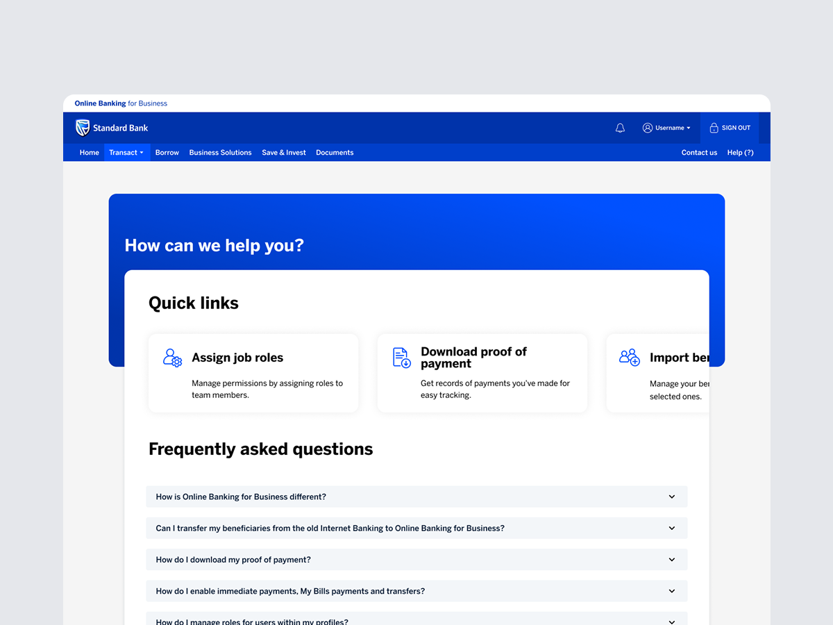
Coachmarks hero image

Migrating a platform is easy. Migrating a habit isn't.

Standard Bank's business customers were being moved in batches from the legacy Online Banking for Business platform (OBB) onto its successor, OB4B. Customers were accustomed to the old platform's layout and navigation — and that familiarity didn't transfer automatically just because the underlying platform had changed.

Without a clear, intuitive way to discover the new platform's features, the risk wasn't hypothetical: low engagement, diminished satisfaction, increased frustration, and weak adoption and retention were all realistic outcomes of a migration that looked complete on the back end but felt disorienting on the front end.

The objective was to make the transition feel natural rather than forced — giving users an accessible way to navigate OB4B and find its features, so they'd feel confident and supported enough to actually explore what the new platform could do, rather than sticking to the few flows they could still half-remember.

A platform migration is invisible to the business, until adoption stalls.

🧭
Old habits don't transfer to new layouts
Customers accustomed to OBB's navigation had no reason to expect OB4B to work the same way and no built-in way to find out where things had moved to.
📉
Low discoverability risks low adoption
Features that exist but aren't found don't get used. Without guided discovery, OB4B's capabilities risked going largely untouched by migrated customers.
⚠️
Retention was the real stake
A frustrating migration doesn't just create support tickets, it creates an opening for business customers to look at competitor banks instead.

Defining what value actually looked like, for the customer and the business.

Before designing anything, the team mapped out what a smooth migration was actually worth on both sides. For customers, ease of transition meant less frustration and a faster learning curve; confidence and control meant fewer errors and a sense of mastery over the new platform; convenience meant finding features quickly instead of searching or calling in.

For the business, the same migration carried clear commercial weight: higher feature engagement, fewer customers leaving, fewer support calls, and stronger revenue through better-used paid services like loans and credit, all riding on whether customers actually discovered what OB4B offered them.

Designing for discovery, not just documentation.

The brief wasn't to explain everything that had changed it was to make discovery itself feel effortless. That meant driving awareness (making features visible and easy to find), encouraging exploration (a welcoming experience that motivates users to look around rather than stick to the one flow they already know), and building retention through growing confidence in the platform's value.

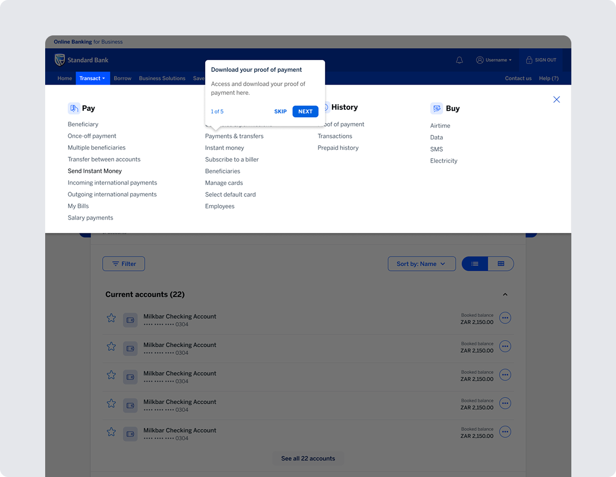
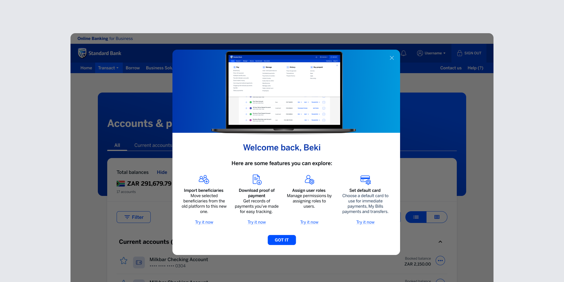
We landed on coachmarks lightweight, contextual overlays that point directly at features in the moment a customer might look for them, rather than front-loading everything into a tutorial nobody reads. This followed established guidance on instructional overlays: present one hint at a time, at the moment it's relevant. Cognitive load research suggests people can hold roughly three to four new pieces of information at a time, so hints were paced deliberately rather than dumped on customers all at once. Coachmarks were also built with flexibility in mind customers could skip or revisit them, keeping control in their hands rather than forcing a fixed walkthrough on everyone.

Contextual guidance, placed at the point of discovery.

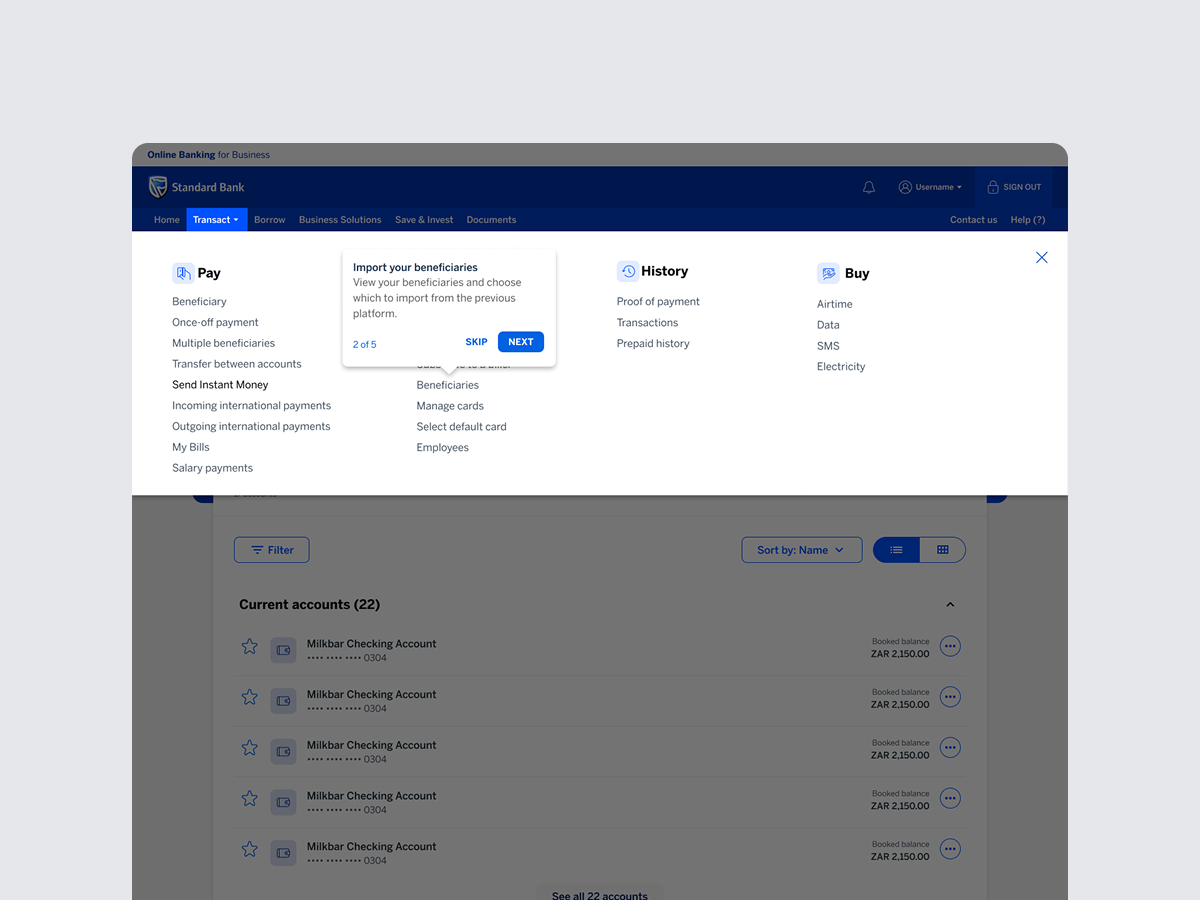
Surfaced where customers would naturally look
Coachmarks appear at the point a customer would plausibly explore a feature, rather than as an upfront tutorial standing between them and their task.
Coachmark appearing in context on the OB4B platform
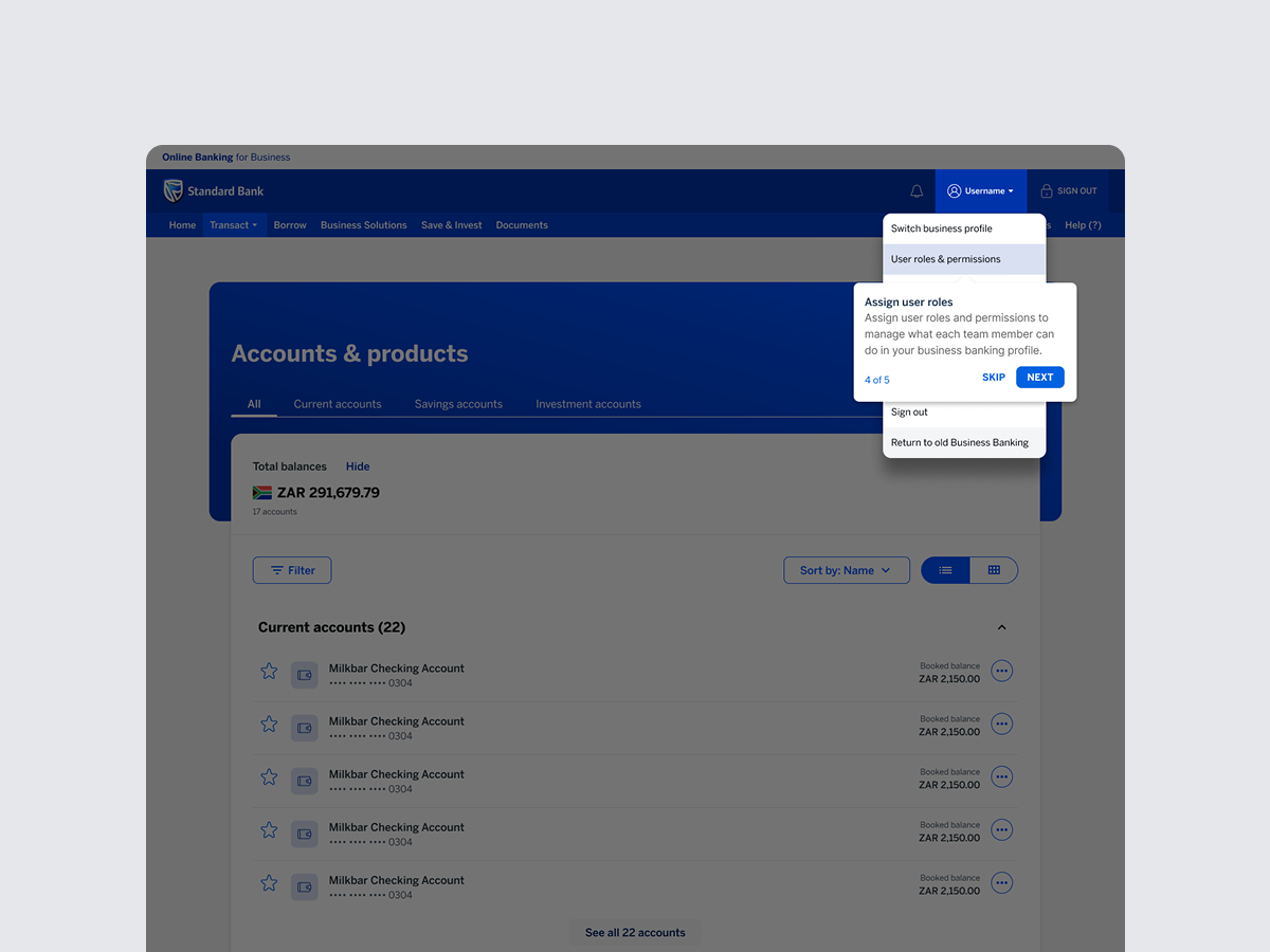
One hint at a time, with the choice to skip
Each coachmark addresses a single feature, respecting short-term memory limits and customers can dismiss or revisit it, keeping the experience in their control rather than a forced walkthrough.
Coachmarks screen
Visually distinct from the underlying UI
Coachmarks use a clearly different visual treatment from the platform itself, so customers immediately recognise them as guidance rather than mistaking them for new interactive elements.
Coachmarks screen

Why not just send a "what's new" email instead?

An early option was a static migration guide or email summarising OB4B's new features, sent out once when a batch of customers moved over. It would have been far cheaper to build. But it asked customers to read and remember a list of features before they ever needed them — exactly the wrong moment to teach something. By the time a customer actually went looking for a specific capability, that email would already be forgotten or unread.

We moved away from this in favour of in-context coachmarks because discovery needed to happen at the point of intent, not before it.

A migration that customers could feel confident navigating.

Coachmarks gave migrated customers a low-friction way to discover OB4B's capabilities without needing a support call or a forgotten onboarding email. The approach was designed to drive the three outcomes the brief called for: more visible features driving awareness, a more welcoming experience encouraging exploration, and growing platform confidence supporting retention directly reducing the risk of customers drifting toward competitor banks during the migration window.

01
A migration isn't finished when the back end is. OB4B could be technically complete and still fail on adoption if customers couldn't find their way around it the platform switch and the experience switch are two separate problems.
02
Control matters as much as guidance. Letting customers skip or revisit coachmarks mattered just as much as the hints themselves forced walkthroughs tend to be the first thing people learn to dismiss.
03
Customer value and business value were the same metric here. Every reason a customer benefited from easier discovery — less frustration, more confidence — mapped directly onto a business outcome: fewer support calls, stronger retention, more feature usage.
Next project
Switching Services: FNB
Banking Self-Service FNB

Switching Services - putting control back in the customer's hands

Role
Product Strategy & UI/UX Specialist
Company
FNB
Team
Solutions Specialist
Period
June 2024 — Aug 2024
FNB Switching Services hero image

Switching banks shouldn't require a phone call.

Customers wanting to switch services to FNB, whether opening a new account or moving an existing product like a loan from another bank, had only one route available: call the contact centre, request a call-back, or wait for a banker to assist. Every step depended on someone else's availability.

Working cross-functionally with a Solutions Specialist, I led the product strategy and UI/UX design for a self-service switching flow that let customers initiate, track, and complete the switch entirely on their own terms — on mobile, at any time.

The brief sat at the intersection of customer experience and operational efficiency - the contact centre was absorbing a steady volume of switching-related calls that a well-designed self-service flow could redirect.

Every switch began with a wait.

📞
No self-service path existed
Switching a service or product to FNB meant calling in, requesting a call-back or waiting on a banker, there was no way to initiate or progress a switch independently.
😟
Silence created anxiety
Once a request was logged, customers had no visibility into where their application stood. The only way to check progress was to call again.
☎️
Call centre load and KPIs suffered
Switching requests made up a steady share of inbound call volume — capacity that could be better spent on calls that genuinely needed a human.

Mapping the journey from both sides of the call.

Working alongside a Solutions Specialist gave the project a view into both ends of the existing process, the customer experience of waiting on a call-back, and the operational reality of what staff were handling on the other end. That dual view shaped the brief: this wasn't only a customer experience problem, it was a workload distribution problem too.

Mapping the existing call-based journey end to end surfaced exactly where the friction sat not in any single step, but in the complete absence of a path that didn't require a live conversation.

Designing for two very different starting points.

The flow had to work for two distinct situations — a brand new customer switching their primary banking relationship to FNB, and an existing customer moving a single product, like a loan, across from another bank. Rather than building two separate flows, the process focused on identifying the shared backbone both situations needed: initiation, document handling, and status visibility then branching only where the underlying banking process genuinely differed.

A self-serve flow that puts timing in the customer's hands.

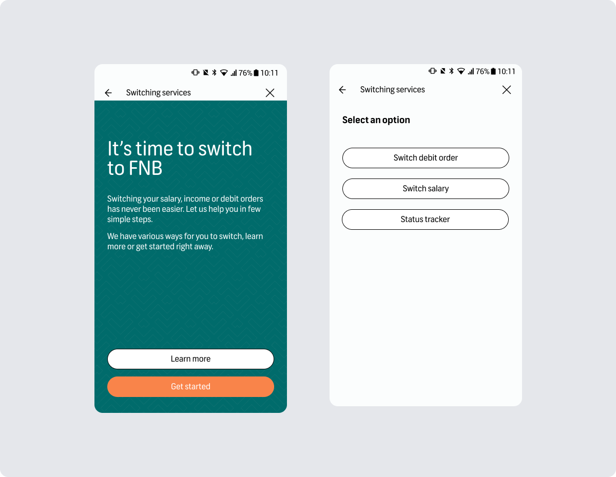
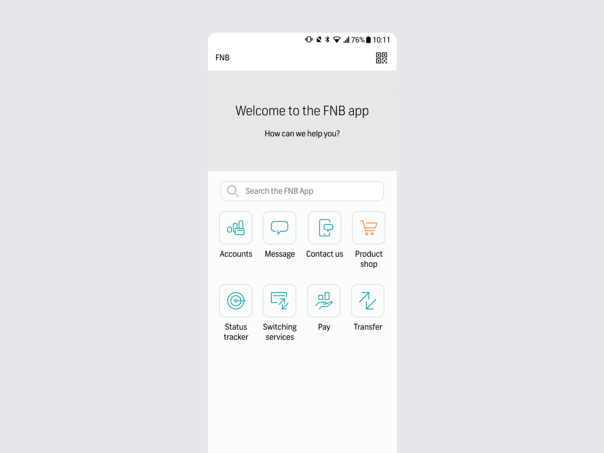
Customers can now switch a service or product to FNB directly from their mobile device — whether they're new to the bank or an existing customer moving something like a home loan or vehicle finance across. The flow was designed to be quick, guided, and transparent from request to resolution.

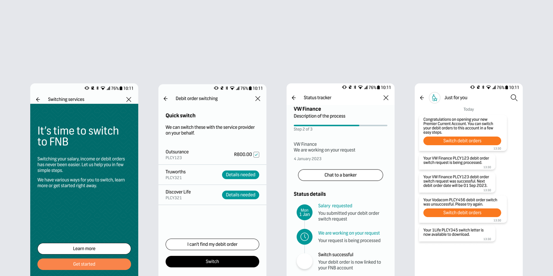
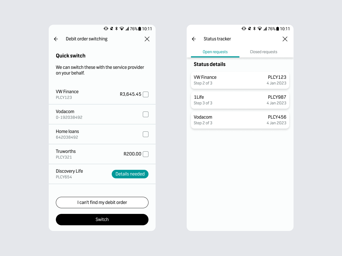
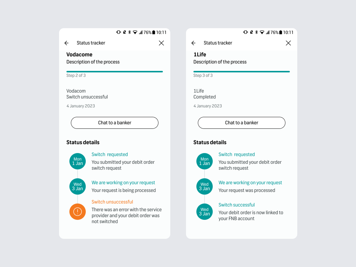
A visible status tracker replaced the old black box. Instead of wondering whether anything was happening behind the scenes, customers could see exactly where their switch stood at any moment — removing the need to call in just to ask "what's happening with my application."

Switch initiation, on demand
Customers start the switch whenever suits them no need to wait for a call-back window or banker availability.
FNB switching status tracker screen
Built for both new and existing customers
The same flow supports switching an entire banking relationship or moving a single product like a loan from another bank to FNB.
FNB switching status tracker screen
Status tracking, end to end
A visible progress tracker shows where the application stands at every stage, replacing the anxiety of silence with clarity.

Why not just speed up the call centre process instead?

An early option on the table was to streamline the existing call flow — shorter call scripts, fewer transfers, faster call-backs. It would have eased pressure on staff without touching the app at all. But it still required the customer to be available at the same time as a banker, and it did nothing for the anxiety of not knowing where an application stood in between calls.

We moved away from this in favour of a self-serve flow because the core problem wasn't call efficiency, it was that customers had no control over timing or visibility at all.

A win for customers and the business.

By shifting control to the customer, the feature let people initiate and track a switch any time, without waiting on staff availability and freed up call centre staff to focus on conversations that needed a real person, supporting their KPIs in the process.

↓10%
Reduction in switching-related calls in the first quarter post-launch
01
Control matters more than speed. Customers weren't only frustrated by how long switching took they were frustrated by not knowing. Visibility into status turned out to be as valuable as the time saved.
02
A shared backbone beats two parallel flows. Designing one flow with smart branching, rather than two separate journeys, kept the experience simpler to build and simpler for customers to learn.
03
Operational wins and customer wins aren't always in tension. Reducing call volume and improving the customer experience turned out to be the same design decision, not a trade-off.
Back to first project
Mobile Companion & Hand Gestures, CANAL+ Group